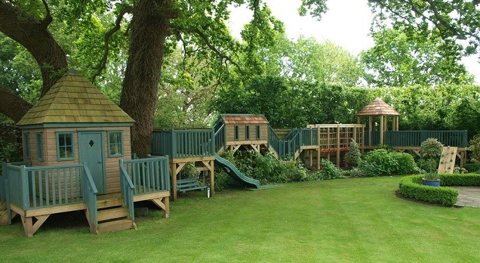
Leading bespoke playhouse manufacturer, the Playhouse Company, has reported a change in its customers' habits and preferences.
Over the course of its 20 years the Playhouse Company has noticed an emerging trend of the choice of colours selected by customers. CEO, Richard Frost, elaborates: "When the company started out, our customers wanted bright colours that really stood out. Increasingly, we're in fact now seeing the opposite with more subtle tones being selected."
Richard attributes this to many factors ranging from fashion and what's popular in culture to perhaps parents now making the decisions. He continues: "Despite what parents think, ultimately our customers are their children! They are the end user. Originally parents wanted their playhouses to be brightly coloured for their children, however we're now noticing that they are choosing something more neutral that blends in with the rest of the garden."
The Playhouse Company is not the only company to have noticed this trend. One of its paint suppliers, the Little Greene Paint Company, has also recognised a change in the most popular paint colours.
Ruth Mottershead, marketing director at the Little Greene Paint Company said: "After the introduction of the grey colour card, we found our customers were choosing the warm, slightly pink grey shades - two years later we have seen a shift from these warm greys to the cooler greys with blue undertones. As a result of this, we introduced the "˜Blue' collection and have seen a noticeable increase in the number of customers using bolder, dark blues such as Hicks' Blue and Royal Navy. These colours have been particularly popular for use on stand-out front doors and statement kitchens."
However, the most popular paint colours remain the classic, more neutral heritage colours like the delicate "˜Celestial Blue' from 1807, the timeless neutral "˜French Grey' and the pure white "˜Shirting.'
This trend was recently also recognised in the announcement of the 2016 Pantone of the Year being announced as Rose Quart & Serenity, a blend of soft colours that are said to be chosen "as consumers seek mindfulness and well-being as an antidote to modern day stresses, welcoming colours that psychologically fulfil our yearning for reassurance and security are becoming more prominent."